A big part of the success of the iPhone, and the iOS ecosystem as a whole, has been
Apple’s focus on both the aesthetic and the experience of the platform and its applications.
Apple did an enormous amount of work establishing the most common application design models
while ensuring flexibility for their developers and consistency for their users. While our
goal isn’t to build an application that attempts to mimic the exact experience of using a
native application, there’s still plenty to be learned from examining the structure and
design patterns used in mobile operating systems. Understanding the interfaces our users
expect is important; it allows us to decide when it’s worth trying to meet those
expectations, and when to go in another direction.Let’s take a look at a few mobile design patterns we might find useful in our
application.
1. The Carousel
Imagine some playing cards placed side by side in the screen, where users can flick
between each “card” by sliding over the screen to the left or to the right.
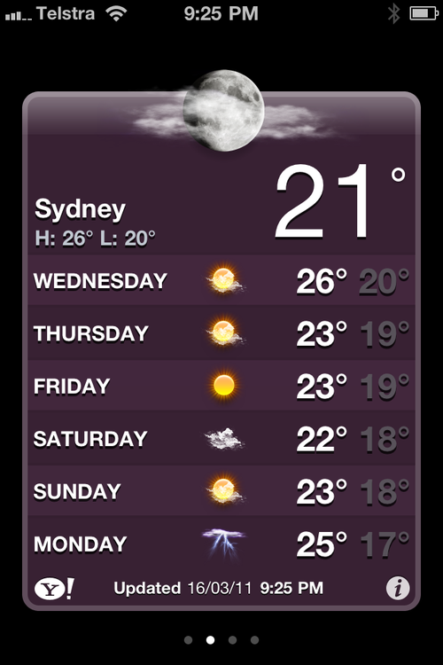
The prototypical example of the carousel pattern on iOS is Apple’s Weather app, seen in Figure 1. The Weather app assigns
each city to a single card. One glance shows all the weather information we need for our
city of choice without the distraction of what’s happening elsewhere.

WebOS also uses the carousel pattern for switching between applications. Apps that use
this pattern are normally information-rich but interaction-poor.
The carousel is the simplest pattern we’ll look at—it usually consists of a single
type of content organized in a linear set. What’s nice about the carousel is that it’s
simple (which is good, remember?). The interface is minimal and the data structure is
incredibly easy to understand. It also offers an implicit hierarchy of importance: the
first items are the easiest to access, and are usually of the most interest to our users.
The flip side to this structure is that there’s no way to move between views more than one
card away.
The Good
The Bad
It relies on gestures—the user has to swipe from card to card, which can be
less intuitive than pressing buttons or menu items.
All the information for a given page has to fit on the screen at the same
time, otherwise the structure breaks down.
Each page needs to be conceptually the same.
Users have to progress through the sequence; they can’t skip
ahead.
2. Tab Bar
The tab bar pattern can be seen everywhere in iOS, Android, and webOS. For web
designers and developers, tabs aren’t exactly a new idea. We’ve been using them to
establish hierarchy and group content into sections for many years. Conceptually, tabs in
mobile applications are identical to those in desktop websites; the main difference is
that the tab bar usually has a fixed position in mobile applications, and so always
appears on the screen. It’s interesting to note that on iOS, the tab bar component appears
at the bottom of the page (near your thumbs), whereas on Android, the convention is to
have the tab bar at the top of the screen (leading into the content).

The tab bar is useful for quickly establishing the structure of an application. It
lets users move easily between the broad sections of an application, and also acts as an
anchor point—the various selected states of the tab bar also signify where in an
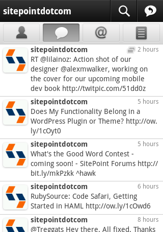
application the user currently is. As Figure 2 shows, the
Twitter app for Android uses a tab bar to let users move between various modes
of another user’s profile.
Good
It provides a familiar navigation for users.
It allows easy switching between modes, views, or tasks.
It indicates the current state/location of the app.
Bad
Its hierarchy is flat—there’s no easy way to have nested subpages.
It always appears on the screen, taking up valuable real estate.
It only handles up to five navigation items effectively, and is clunky
beyond that.
3. Lists
Lists are the most commonly used design pattern for mobile applications. The list as
an interface model is fairly self-explanatory: content is displayed in a vertical list,
allowing users to scroll through the options. In iOS, they can be seen everywhere,
featuring in all but the simplest of utility applications. While basic, they’re also
incredibly flexible. Lists can be used for presenting actionable options; acting as an
index for a long list of content; and, most importantly, as a navigation hierarchy that
lets users work their way down a tree structure.
It’s as a navigation model that lists are most powerful. There are really no limits to
the depths of navigational hierarchy that lists can accommodate and so, for applications
with a structure more than one level deep, the list is almost universally turned
to.
This pattern maps perfectly to the framework we’re used to dealing with online. The
list structure is a tree that can lead anywhere, and often it’s used to let users drill
down from an index of items to a detailed view of a single item. This is known as the
master/detail pattern, a model that’s used in desktop
and mobile applications all the time. Just about every email application ever made uses
this pattern of interaction, letting us quickly skim through the available items and then
focus on a single one. We’ll return to this idea a little later on.
For example, News.com.au uses the list pattern, allowing users to skim the headlines
before moving into whichever story catches their interest, as you can see in Figure 3.

The main limitation of lists is that as soon as a user moves down the tree, they lose
the ability to move to any items on the levels above in one simple step. From four levels
down, they would have to retrace back three levels to return to the top level—not ideal.
To overcome this deficiency, the list structure is often combined with the tab bar pattern to create a strong, structured navigation with depth and
flexibility.
Good
Bad